Creating shirt graphics for We Run and Ride. And through that process have come up with a philosophy that expresses the goals of this blog.
There is a front graphic that looks like this on a white shirt with black shoulders. (cycling)

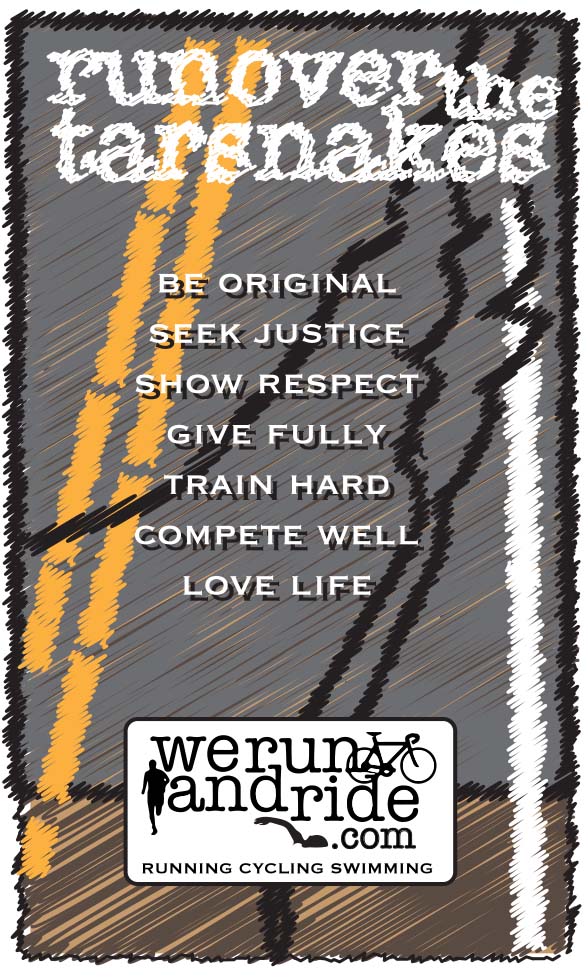
And a back graphic that is looking like this with a couple centering tweaks.
Would love to know what you think.
Thanks!
About Christopher Cudworth
Christopher Cudworth is a content producer, writer and blogger with more than 25 years’ experience in B2B and B2C marketing, journalism, public relations and social media. Connect with Christopher on Twitter: @genesisfix07 and blogs at werunandride.com, therightkindofpride.com and genesisfix.wordpress.com
Online portfolio: http://www.behance.net/christophercudworth


The front graphic is kick ass. It’s going to be too expensive to do both front and back, the market is pretty fickle that way. Think of something small that would work like a tag, just below the collar, betwixt the shoulders… That would keep the cost reasonable so you can make a few bucks for your trouble and make the shirt cooler (by less busy) in the process. Good luck, man.
Voler has a front and back program for semi-custom. Thank you for the suggestions. Their options are front oriented, but I may go simpler as you suggest on the front.
Good luck, brother. Nicely done.
I like the rear one. More tarsnakes Dn’s easier to read.